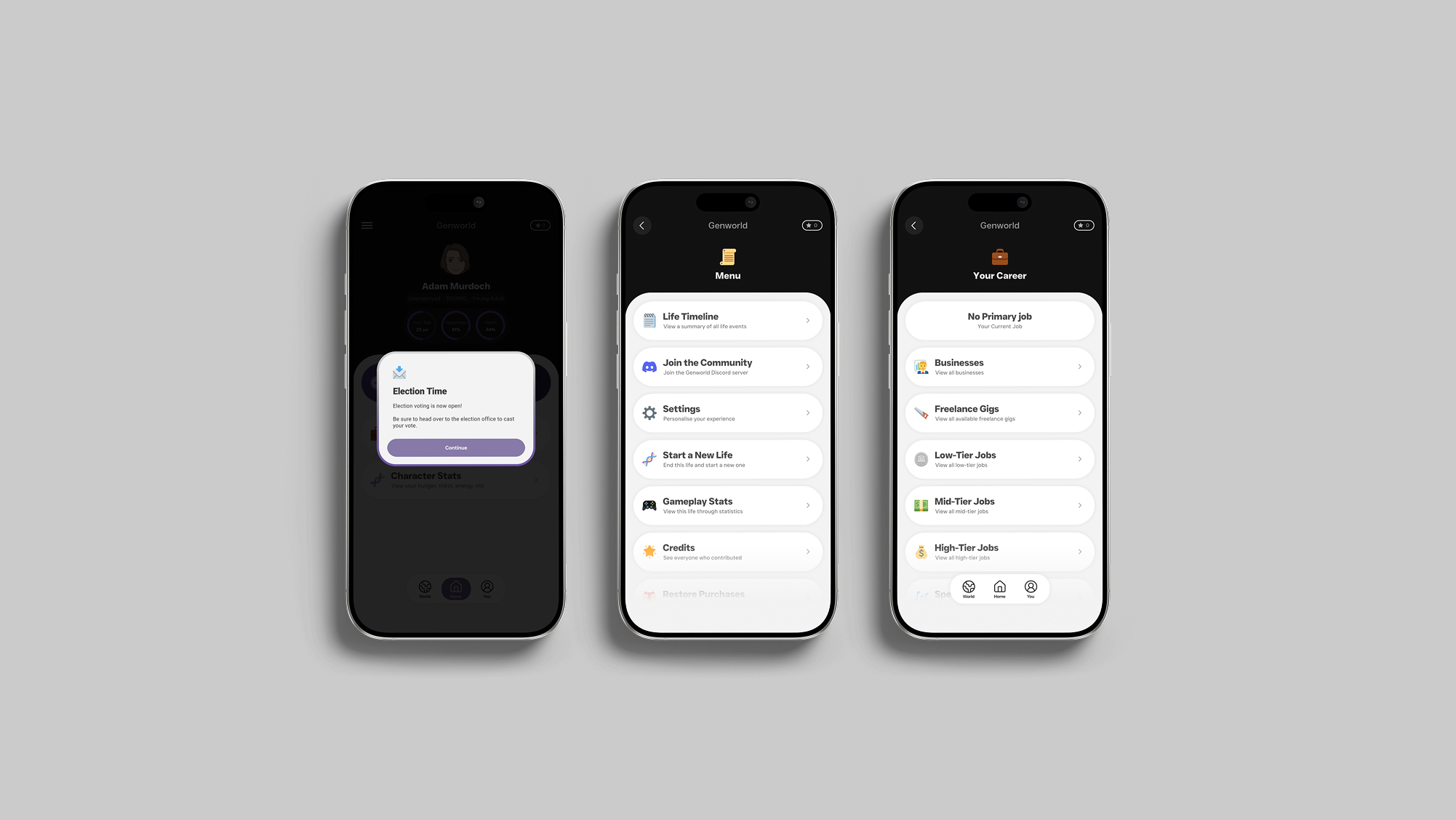
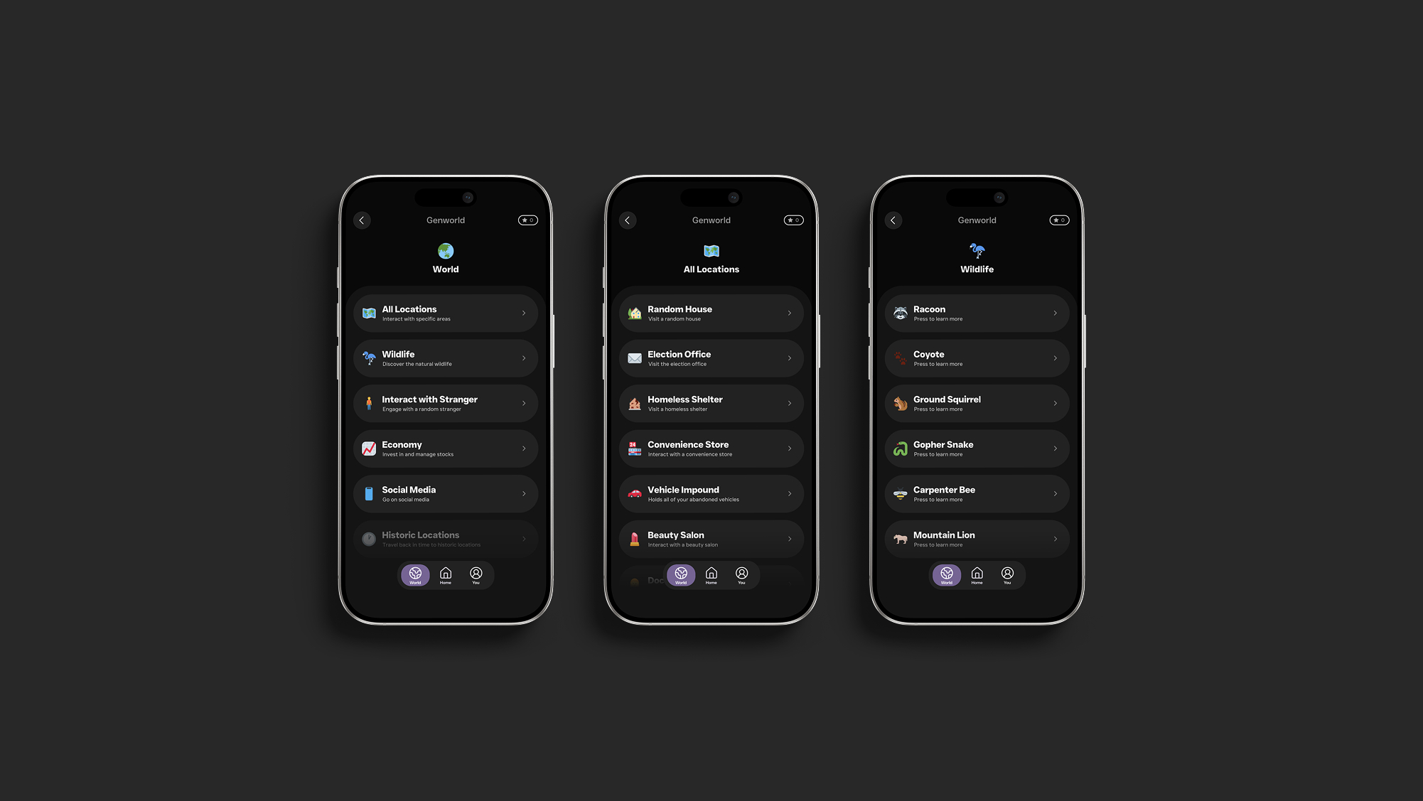
Players begin sessions with a specific goal for their character's life
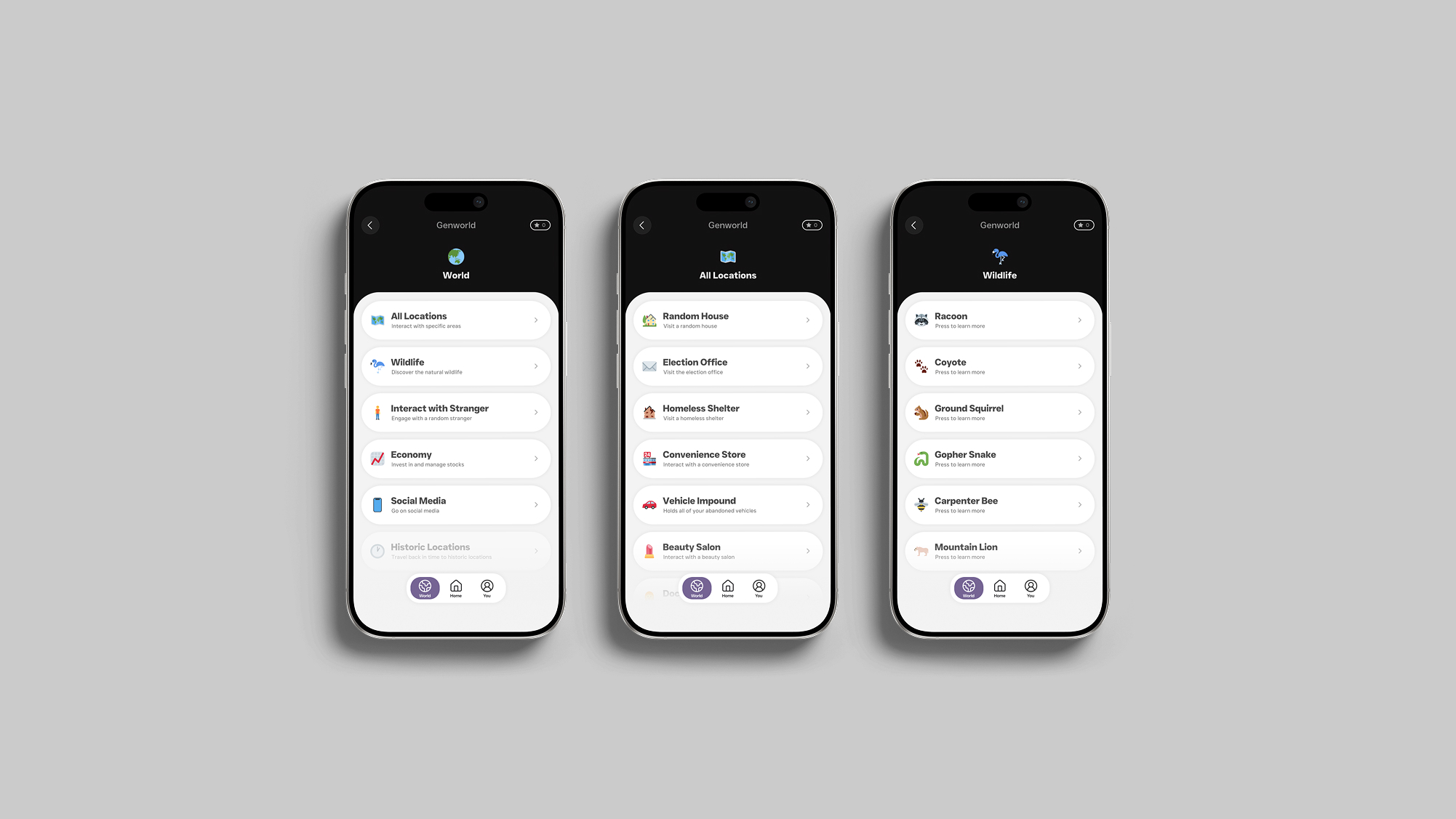
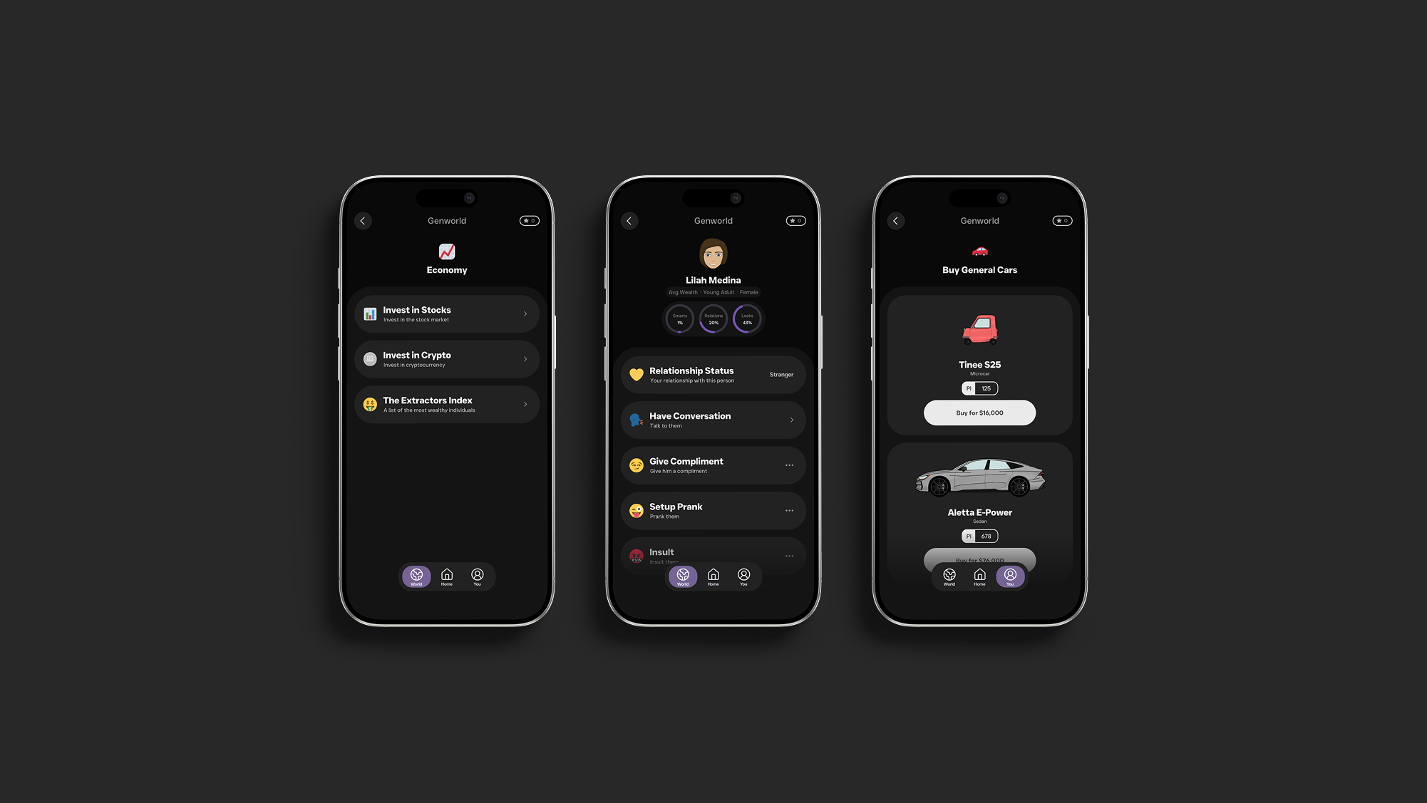
Ensure the game offers a large number of features that together support multiple gameplay styles.
Genworld is a mobile life simulator I independently designed, developed and launched over 15 months. The challenge is to create a feature-rich game that is immediately understandable while also providing a financially cheaper alternative to heavily monetised competitors. To inform this process I conducted three unique surveys with 75 total participants, four interviews and a 72-person usability test. Since releasing in May 2026, Genworld has exceeded 40,000 downloads with an average engagement time of 40 minutes.
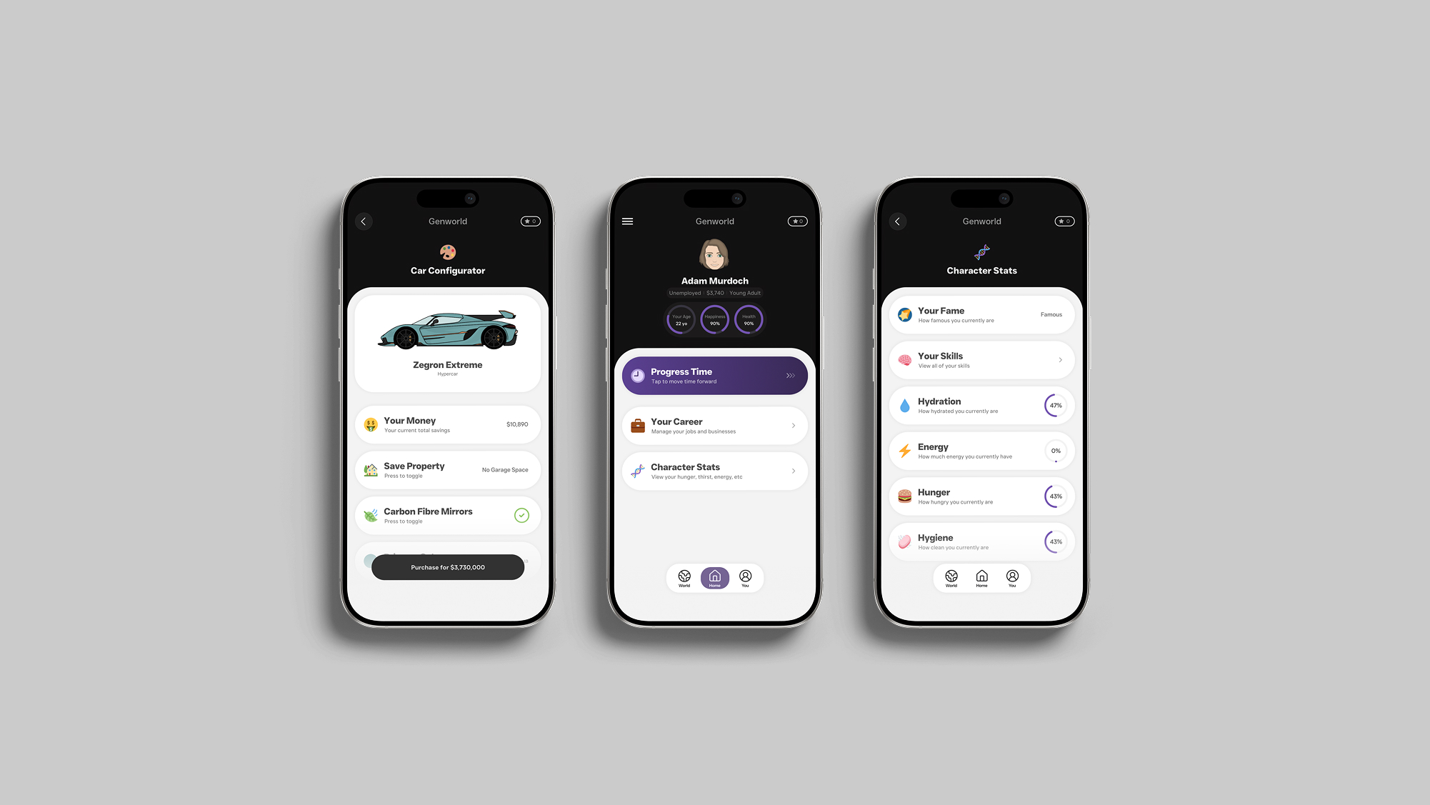
Unity, Figma, Visual Studio Code, Figjam, Notion, Github, Maze
Individual
3 Months
15 Months
Commercial Release
Before diving into the project, I set out to understand a bit more about the existing alternatives using a SWOT analysis.
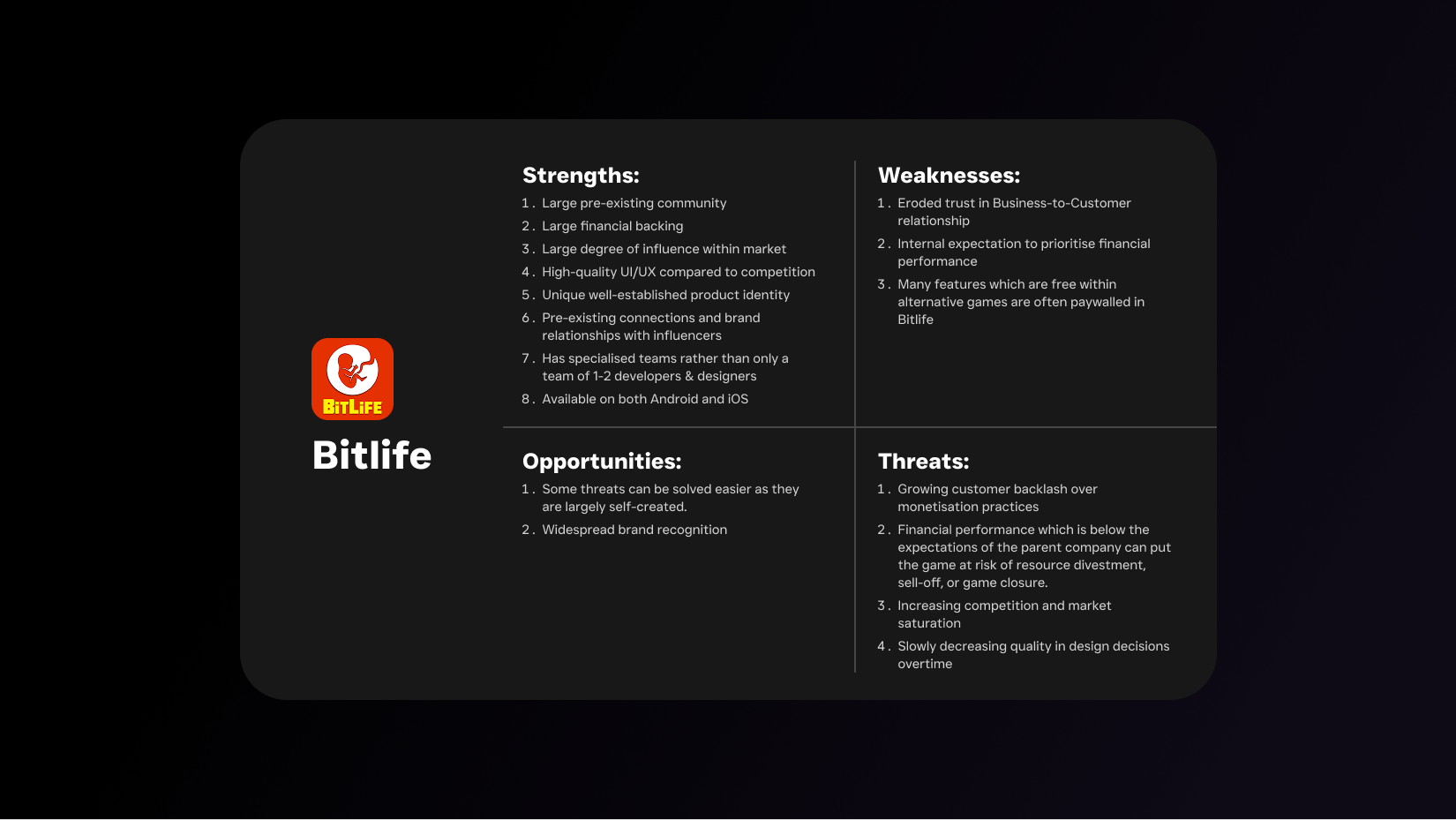
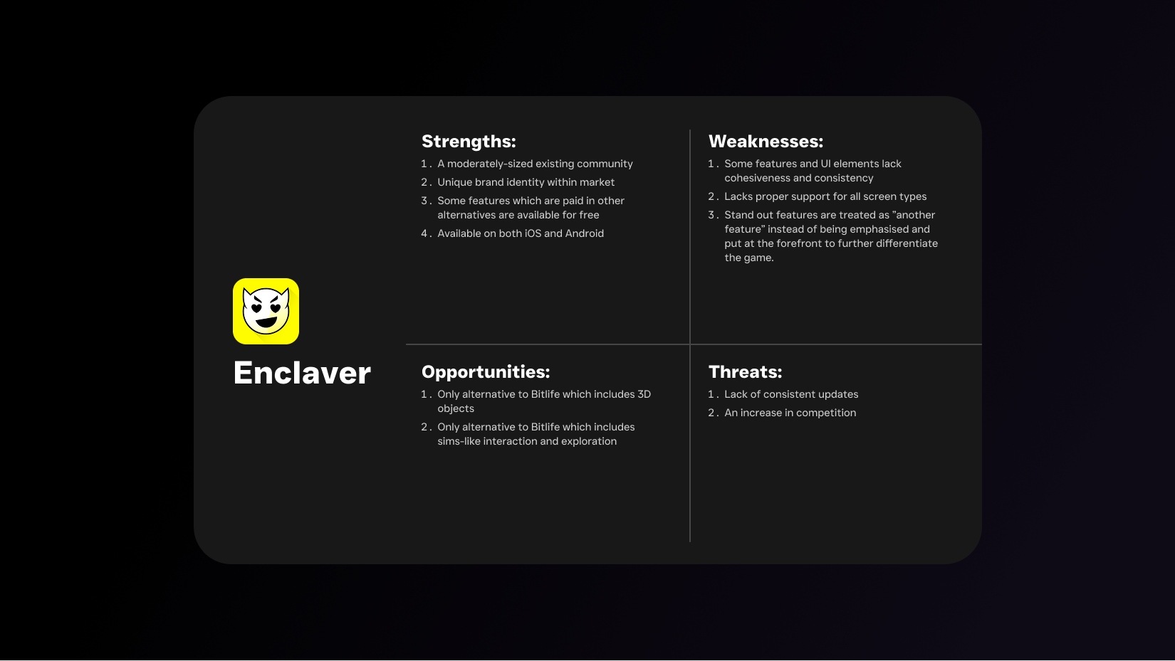
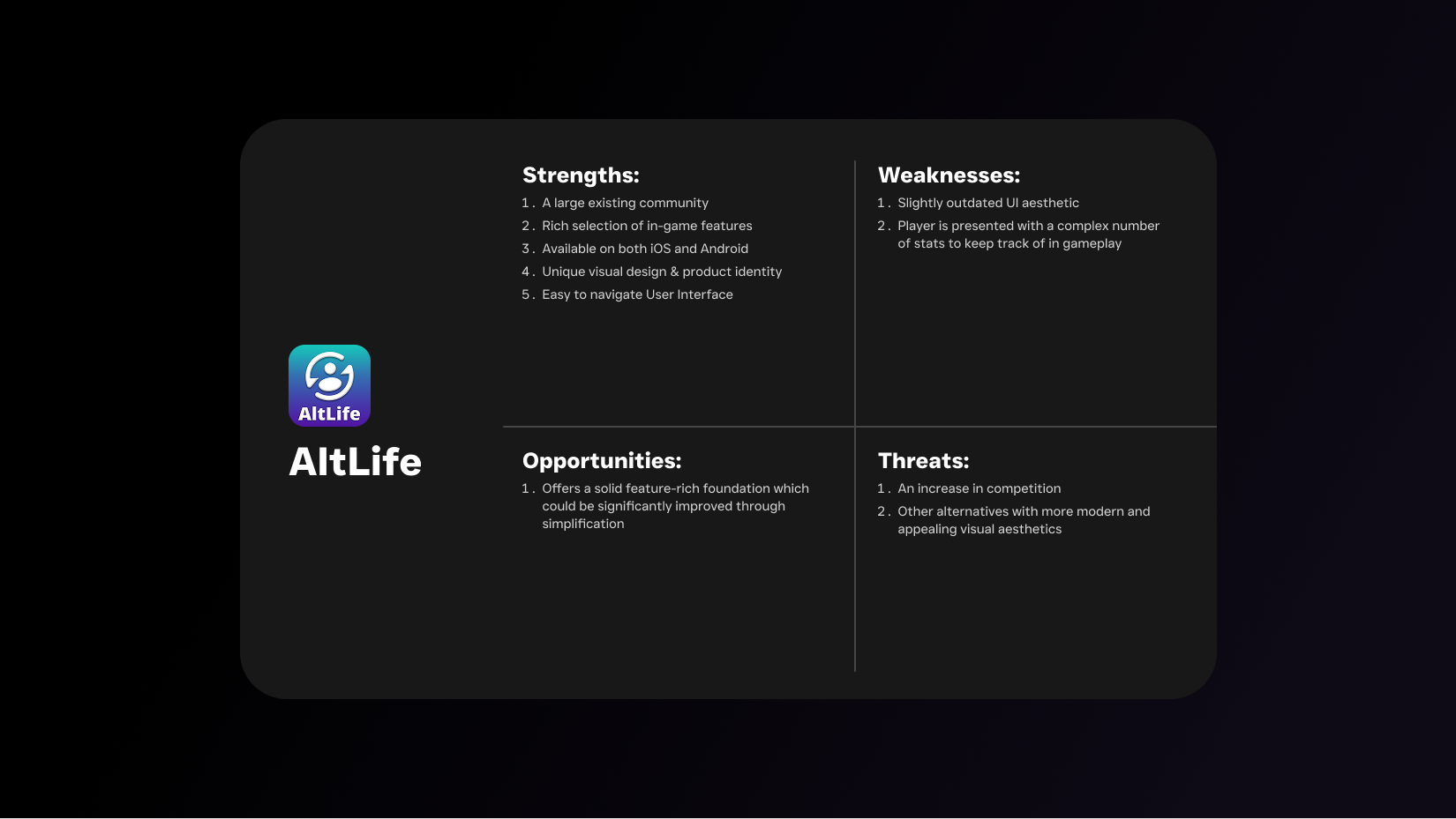
While there are alternatives to market leaders such as Bitlife, Bitlife remains at the forefront due to its superior design quality and feature diversity, advantageous access to large financial and talent resources, and carefully crafted product identity. For a market alternative to have potential to successfully compete against Bitlife it needs to tick the following boxes:
Offers most features and content to players for free.
Is available on both iOS (App Store) and Android (Google Play Store) for free.
Is surrounded by a large and dedicated community which shows an active interest in the project being developed.
Offers one or more stand out features which both differentiates the game from all other competitors and meaningfully changes the core gameplay.
Offers an experience which is still familiar to existing players of mobile text-based life simulators.
Has a UI/UX which is consistent in-game and across many screen types, visually appealing, easy to navigate, and stands out when compared to alternative text based mobile life simulators.
Receives consistent updates which meaningfully add to the gameplay experience.
What monetisation models are most preferred among players of text-based life simulators and what is the overall attitude towards monetisation within this market?
Why do players of text-based life simulators play these kinds of games?
What level of performance do the mobile devices of text-based life simulator players most commonly have?
How often do players of text-based life simulators play these kinds of games and how does this differ compared to their playtime of other types of games?
What are the most commonly spoken languages among players of text-based life simulators?
How do players of text-based life simulators view the life simulator game market and its future trajectory?
What do players of text-based life simulators associate with a high-quality gaming experience when playing text-based life simulators?
To answer the questions set out in the research goals, I conducted 3 separate surveys which included a total of 75 participants between all surveys. These surveys were conducted to primarily gather quantitative data using Google Forms and featured multiple question formats such as multiple choice.
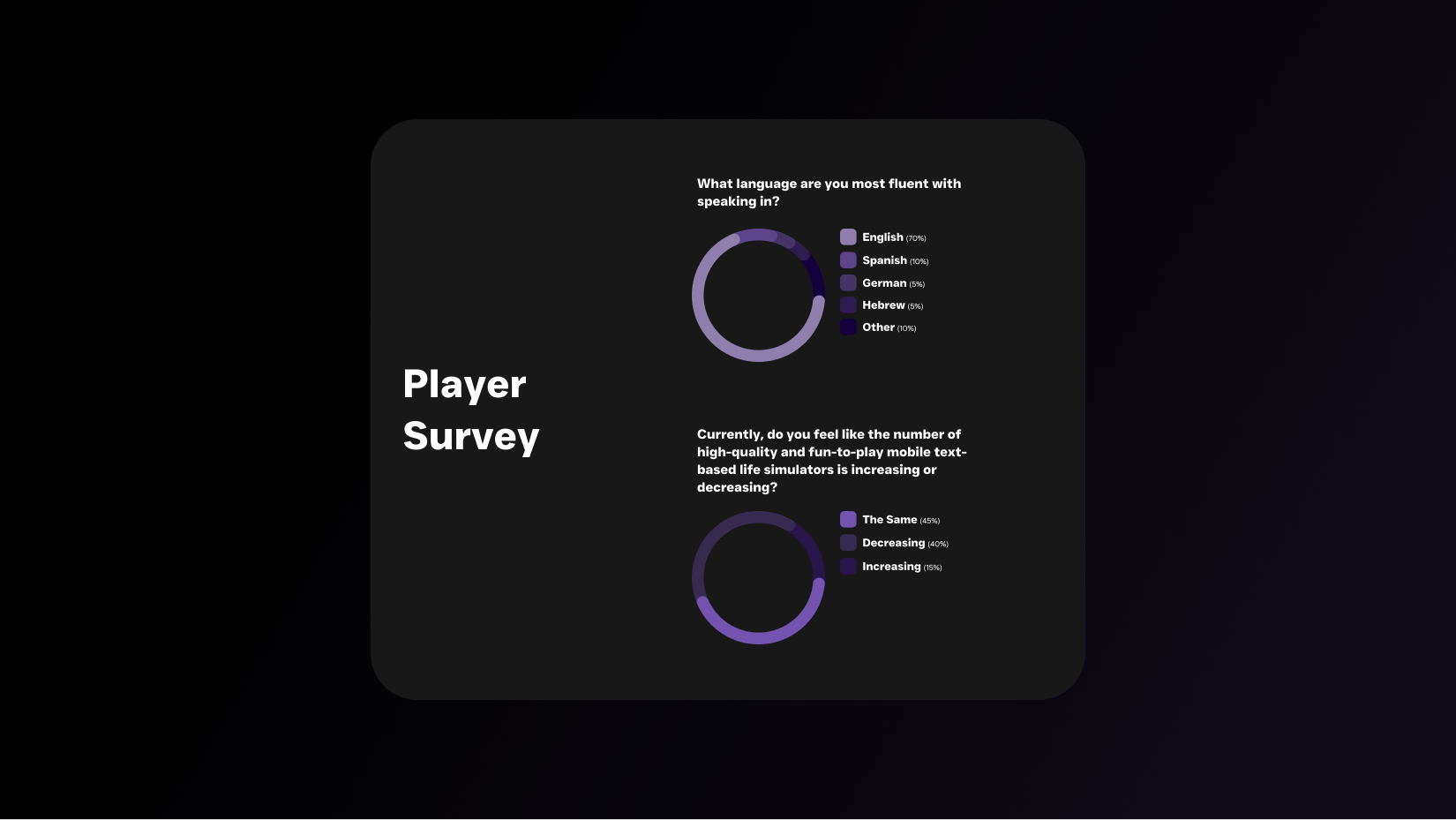

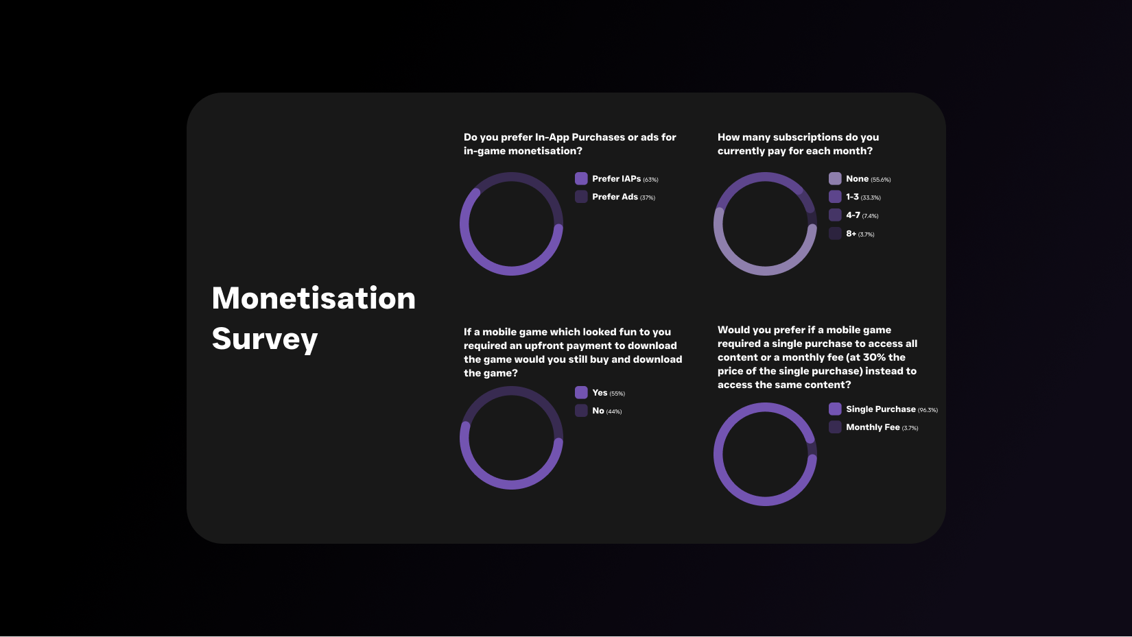
After conducting surveys, I interviewed 4 individuals from the Genworld discord server using Discord's call feature. Going into these interviews, I had the objective of answering any unanswered or new questions from the prior surveys and research.
From conducting these interviews I uncovered the following:
Players often enter a play session with a pre-determined gameplay goal.
Players care deeply about perceived realism
Players feel like existing life simulators are too visually similar.
The goal set by the player can hugely vary
Achievements are often not a primary consideration in regards to progression
Live out an alternative fictional life.
Experiment with realistic and appealing activities which are inaccessible in real life.
Access an engaging, convenient, and accessible source of entertainment which supports both long and short gameplay sessions.
Make sufficient revenue to cover past and continued development costs.
Maximise player engagement and retention within the game.
Create a product which reflects and embodies the business’s core qualities (quality, innovation, simplicity).
Create a smooth and visually appealing user experience but not at the cost of responsive navigation.
Minimal ability to utilise server dependent functionality due to limited financial resources.
Ensure a consistently high quality UI across multiple screen types and designs.
Upon recognising goals and considerations from the surveys, interviews, topic research, and SWOT analysis I created an empathy map to understand what the typical user does, says, thinks, and feels. This helped me better empathise with the user's intent when completing tasks within a relevant digital experience.
Using all research findings from the topic research, surveys, and interviews I pieced together a user persona to help empathise with the target audience, ensuring design decisions are done with the utmost consideration of the player.
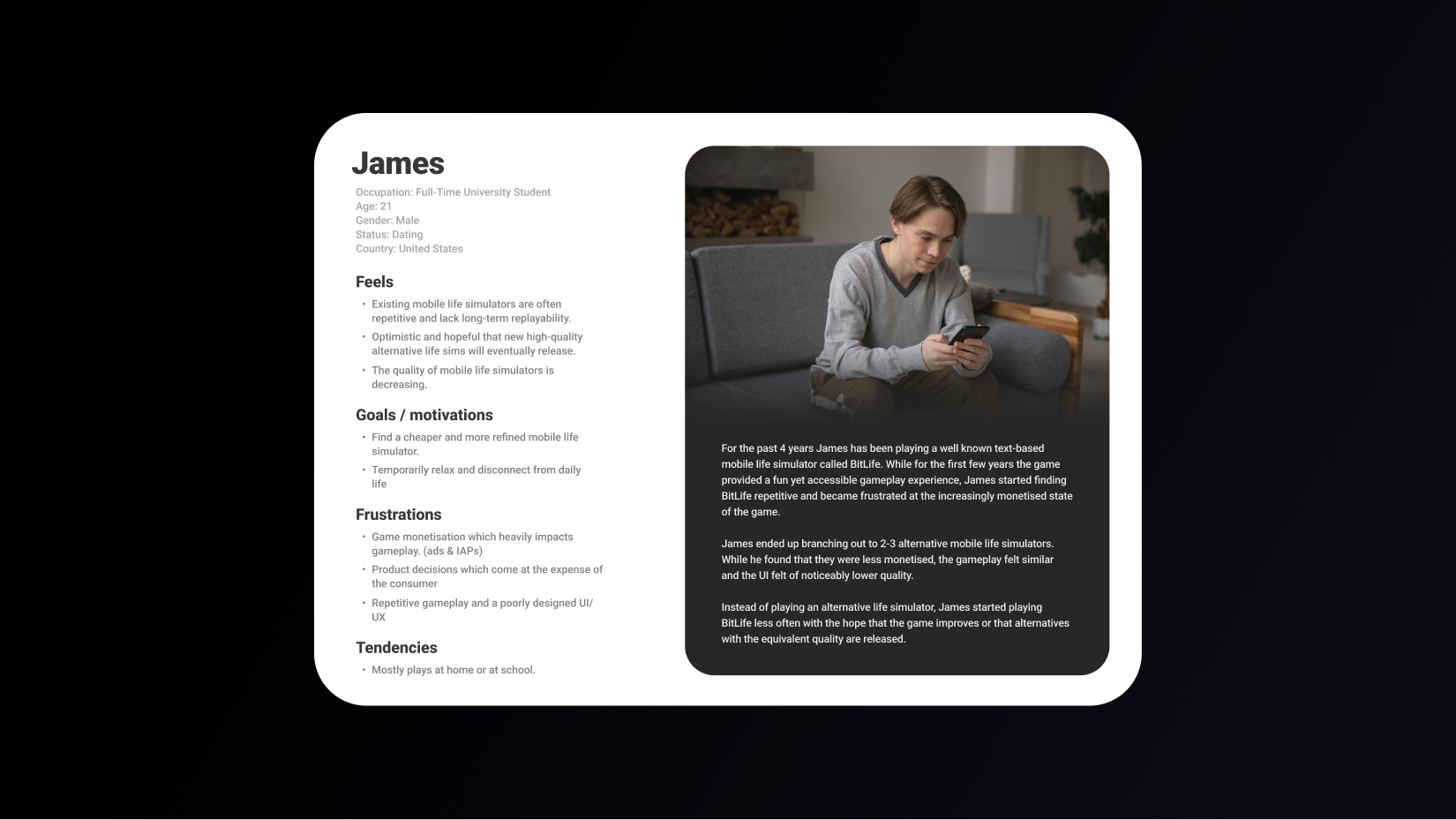
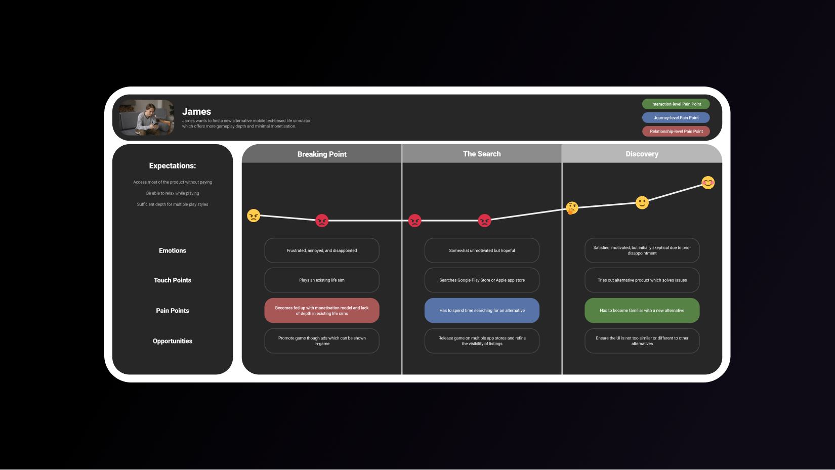
To further empathise with the target audience and the journey they may go through I chose to create a journey map. This enabled me to map out the touch points, pain points, expectations, and opportunities that a player within the target audience may go through before discovering Genworld.
Ensure the game offers a large number of features that together support multiple gameplay styles.
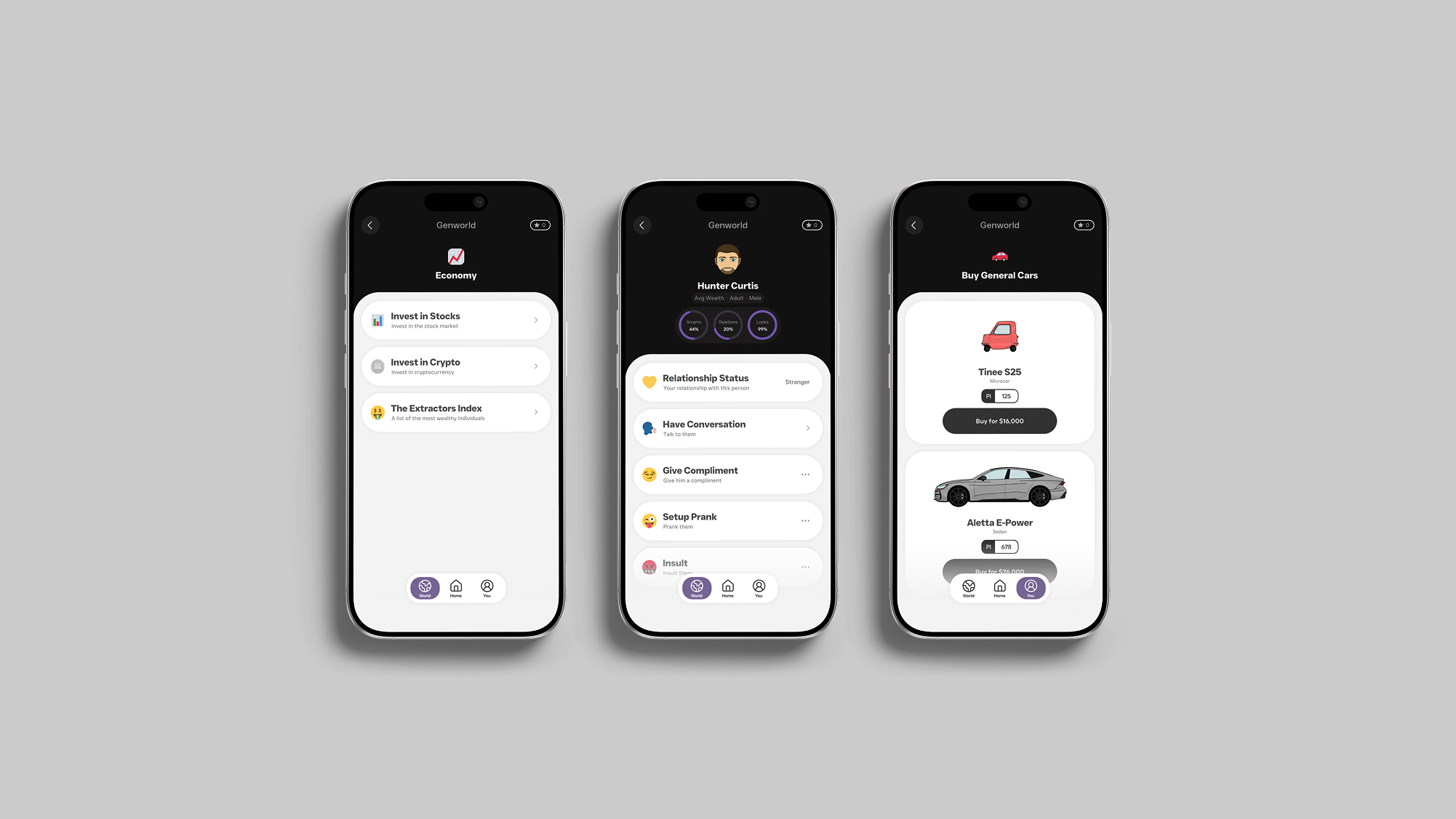
Ensure player actions aren't just cosmetic but instead clearly have a meaningful yet realistic impact.
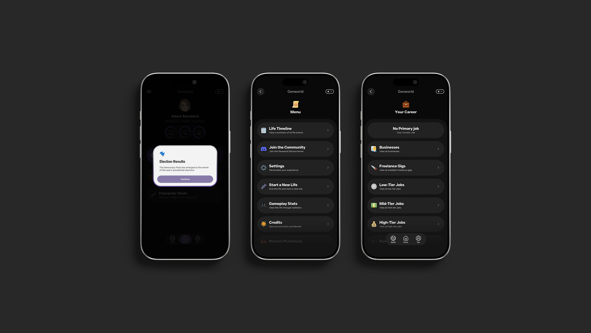
Stand out by offering a high-quality UI while also using a unique layout and colour palette.
Make IAPs minimally invasive within the user experience to give players room to decide if they want to spend real money based on provided value.
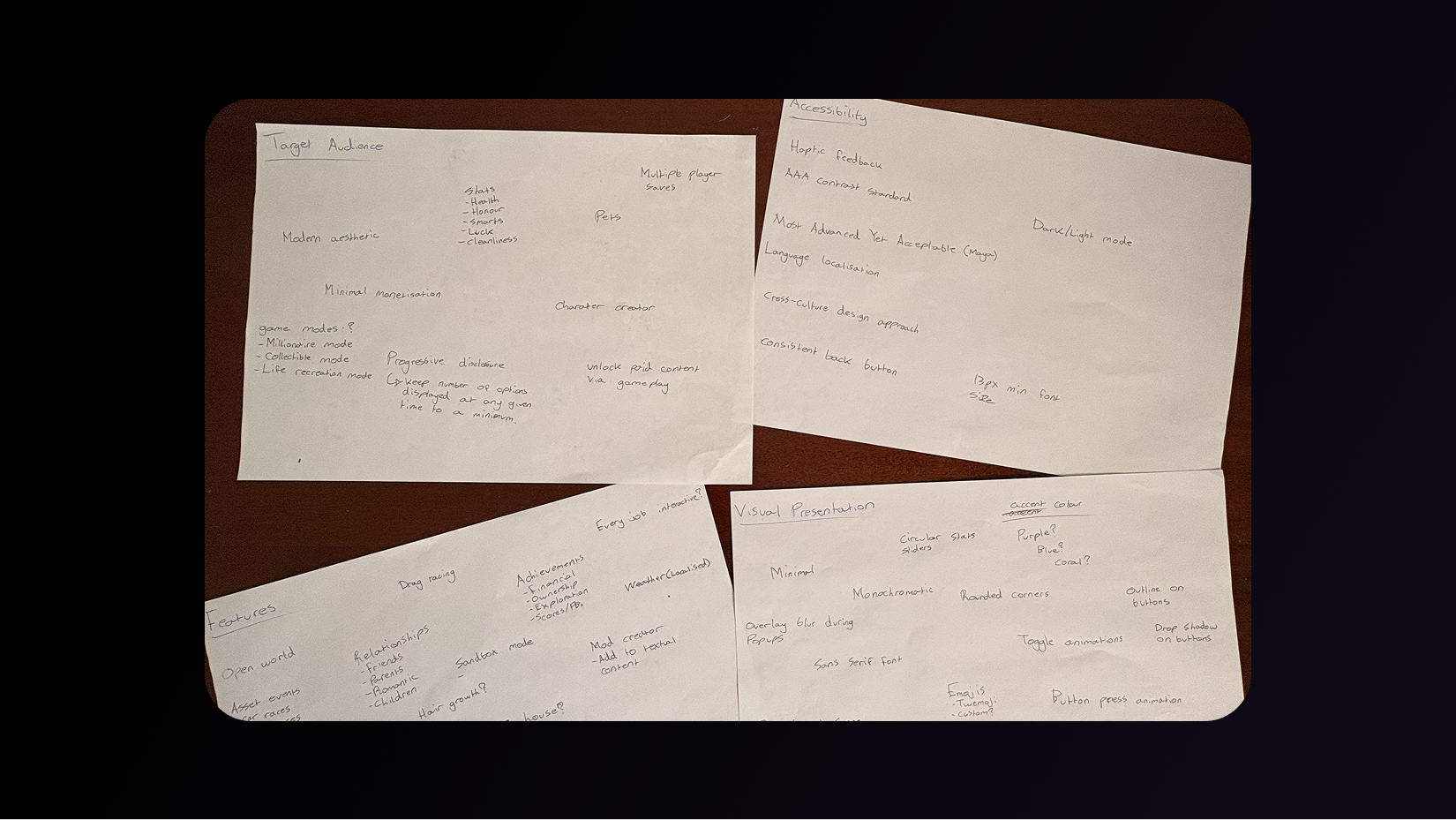
Before starting the design process, I unleashed all of the ideas that came to mind. For brainstorming I decided to lay out my raw ideas onto 4 sheets of paper, with each piece of paper being a category. The categories were features, visual presentation, accessibility, and target audience.
Using all data available up to this point, I created an affinity map to help identify patterns within user behaviour that could help inform how information is distributed across the game. This ensured that the information architecture and overall final design of the game was constructed around common behavioural and mental patterns, enhancing the use of a user-centric design approach.
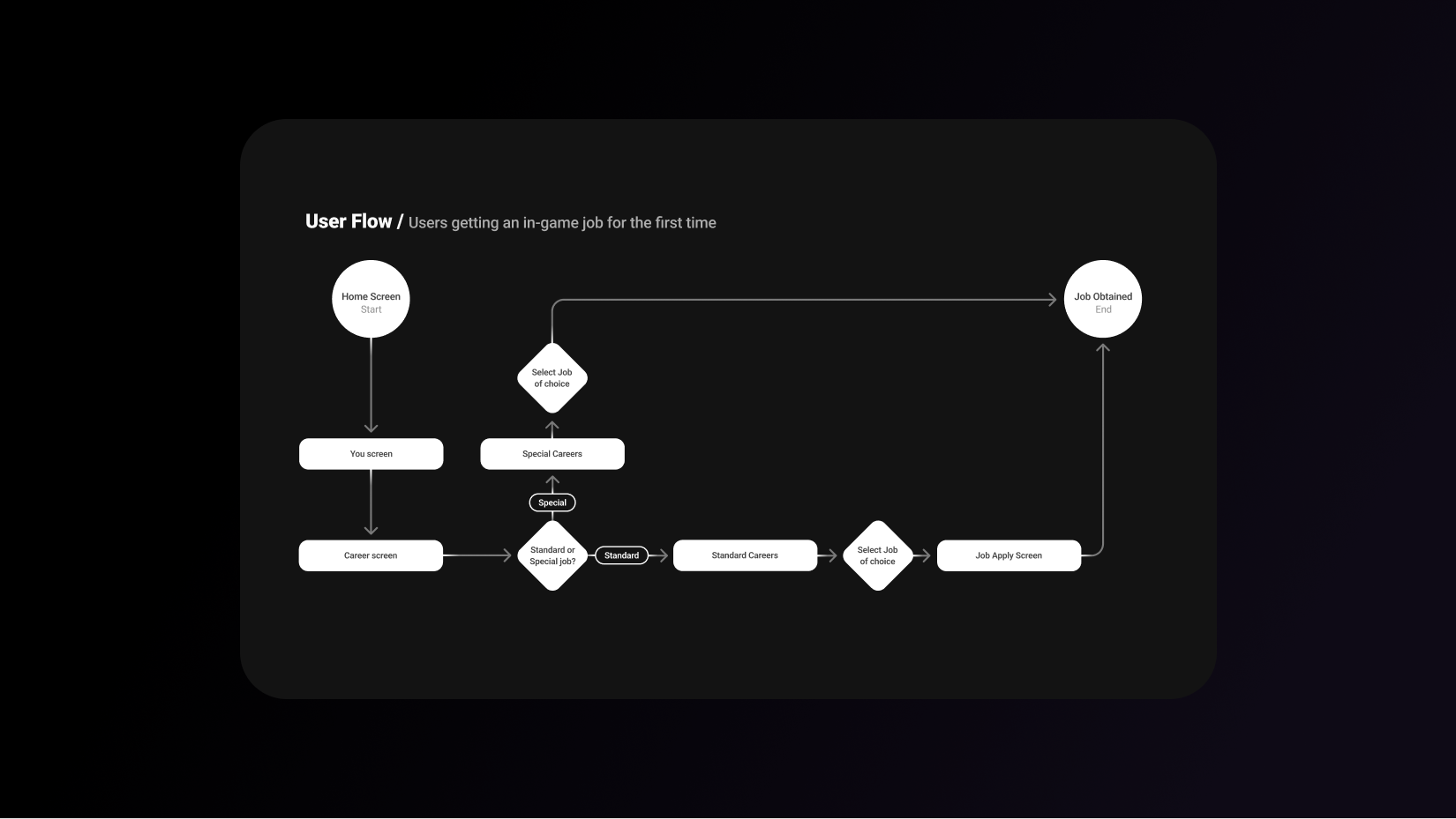
To avoid designing without any clear direction, I designed the user flows and sitemap based on the prior ideation. This ensures that the screens which need to be designed are designed without unnecessary back and forth due to the game's navigational structure remaining fluid.
Furthermore, by creating user flows and a sitemap I was able to plan the navigational experience before designing, helping ensure that necessary time is spent on refining the navigational experience, reducing friction.
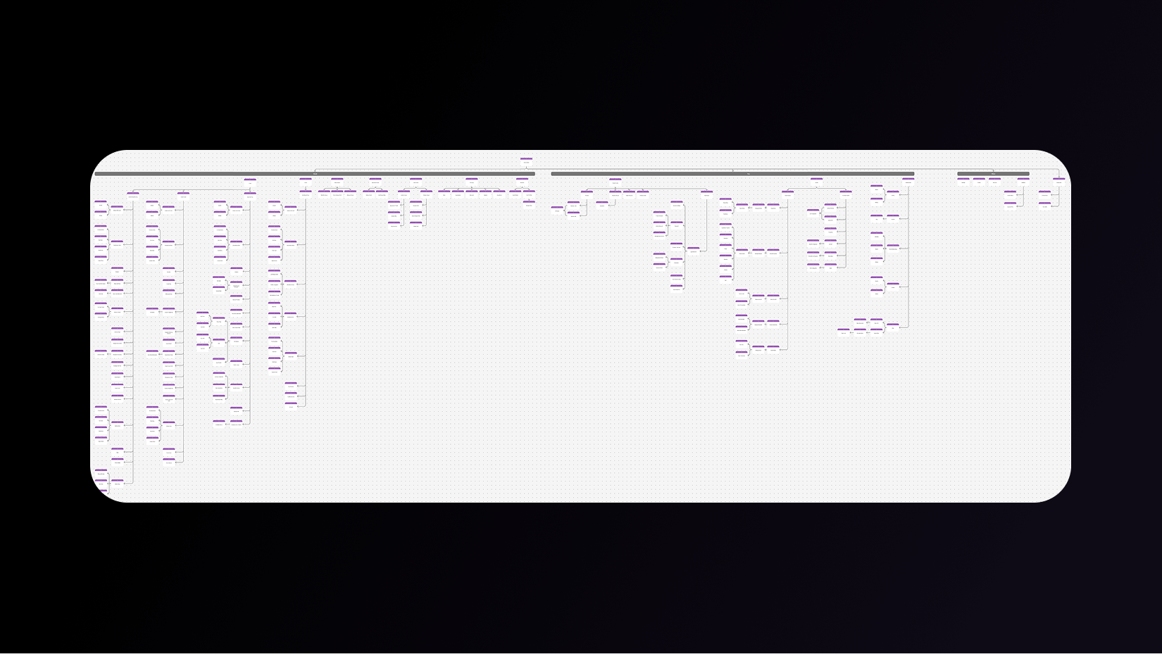
Now that the structure, goals, and target audience were all clearly defined, it was time to design Genworld. For low-fidelity wireframes I decided to experiment with dozens of layouts and approaches. These different approaches were then considered for the layout of the high-fidelity concepts and final design.
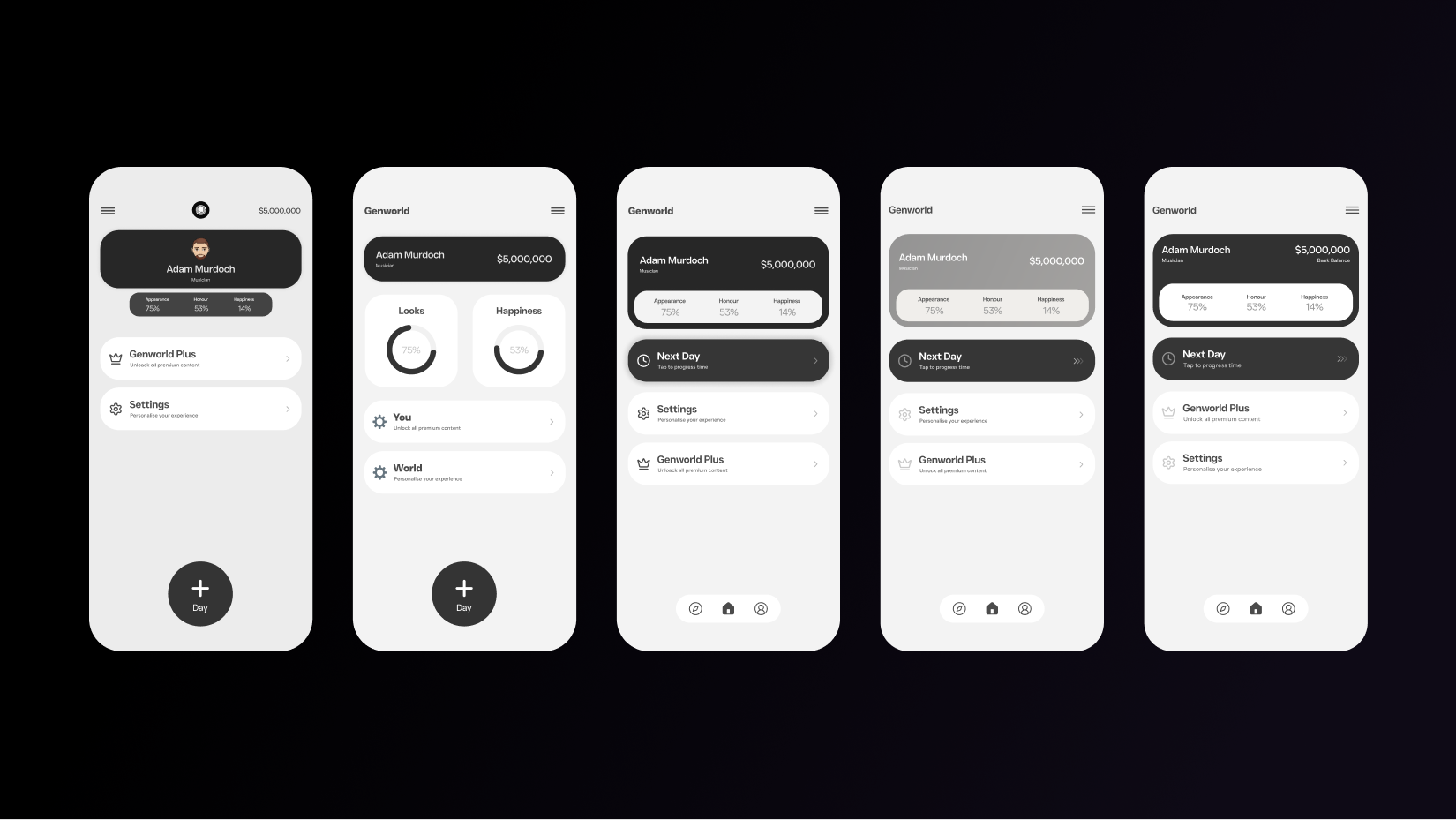
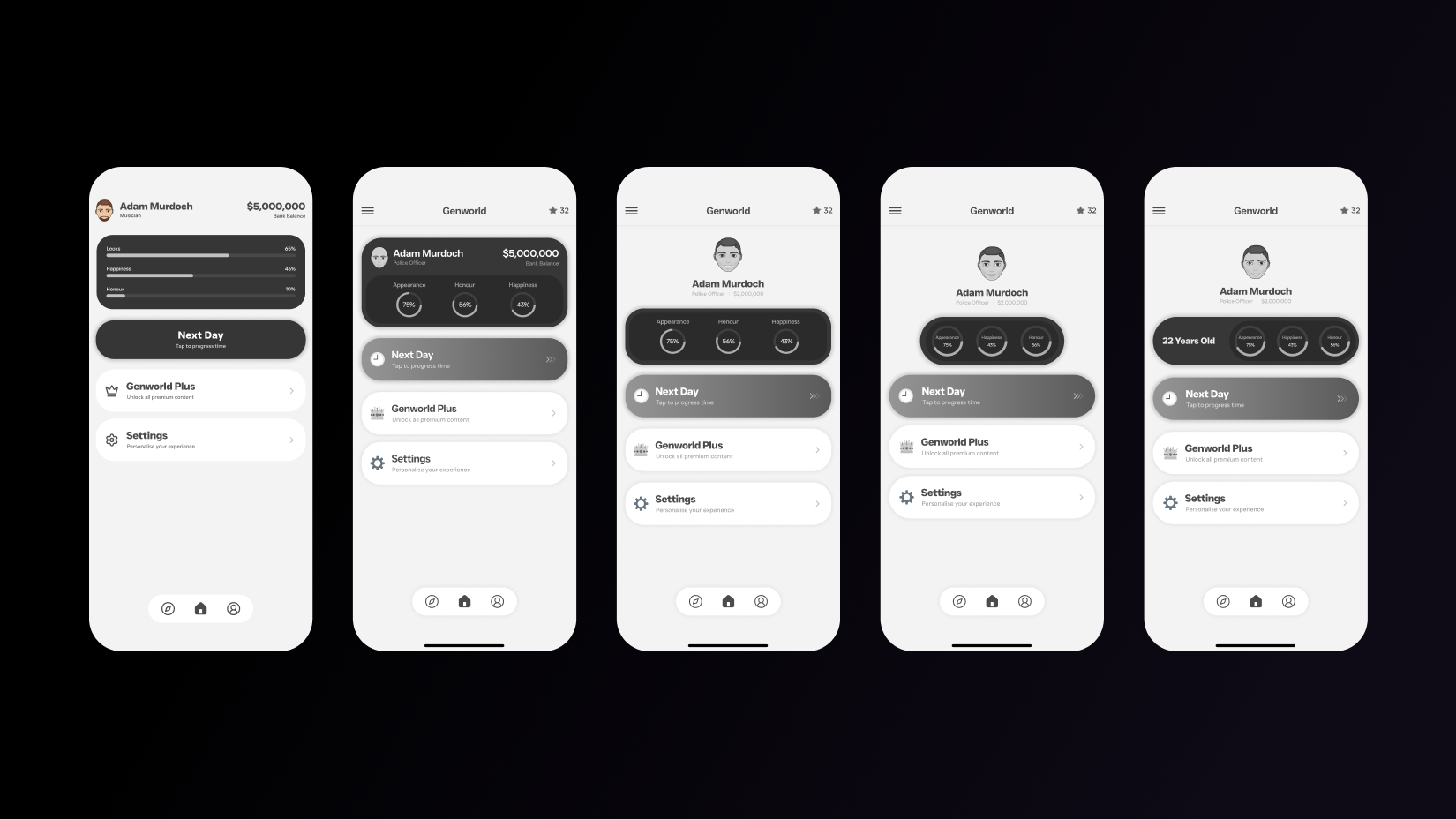
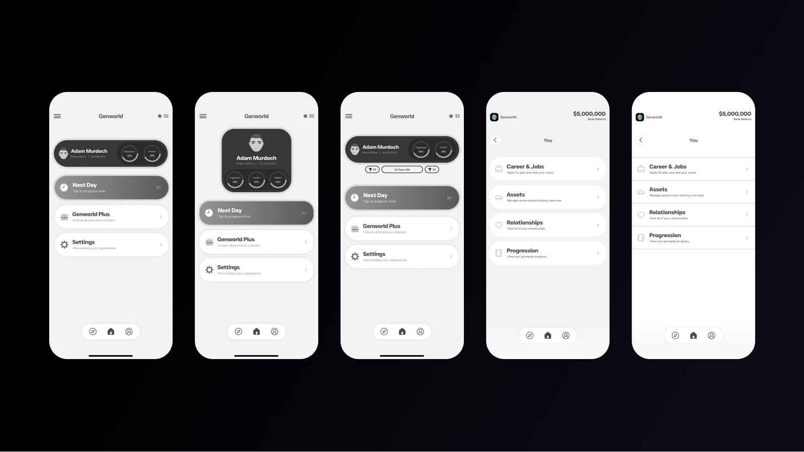
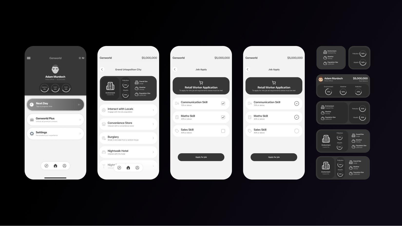
Based on the designs which were created from the low-fidelity wireframes, I created 3 concepts that combined various different layouts and aesthetics into 1. Once designed, one concept design was chosen as a foundation for the final design's layout and aesthetic.
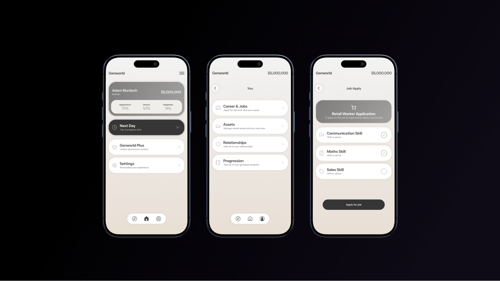
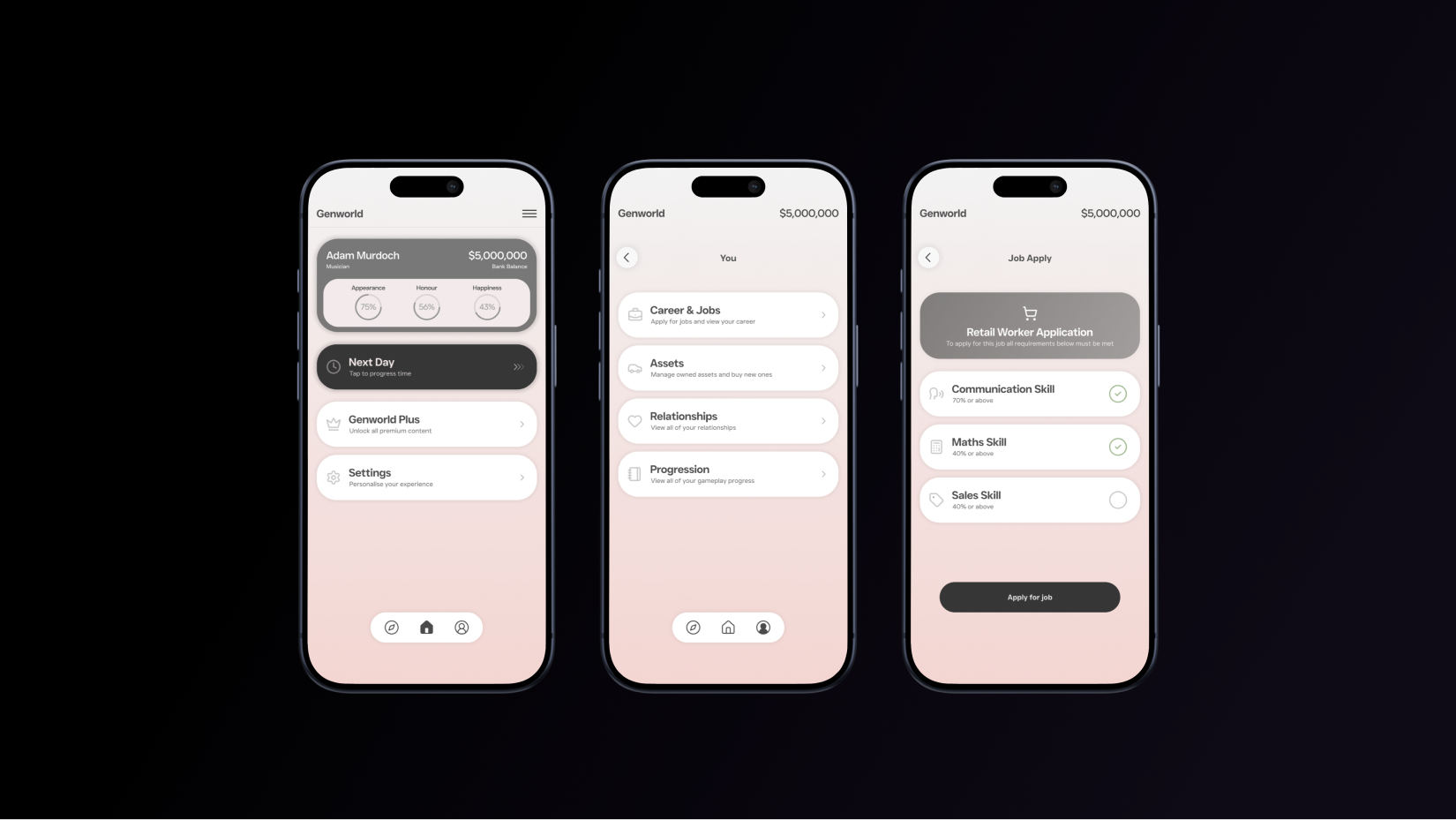
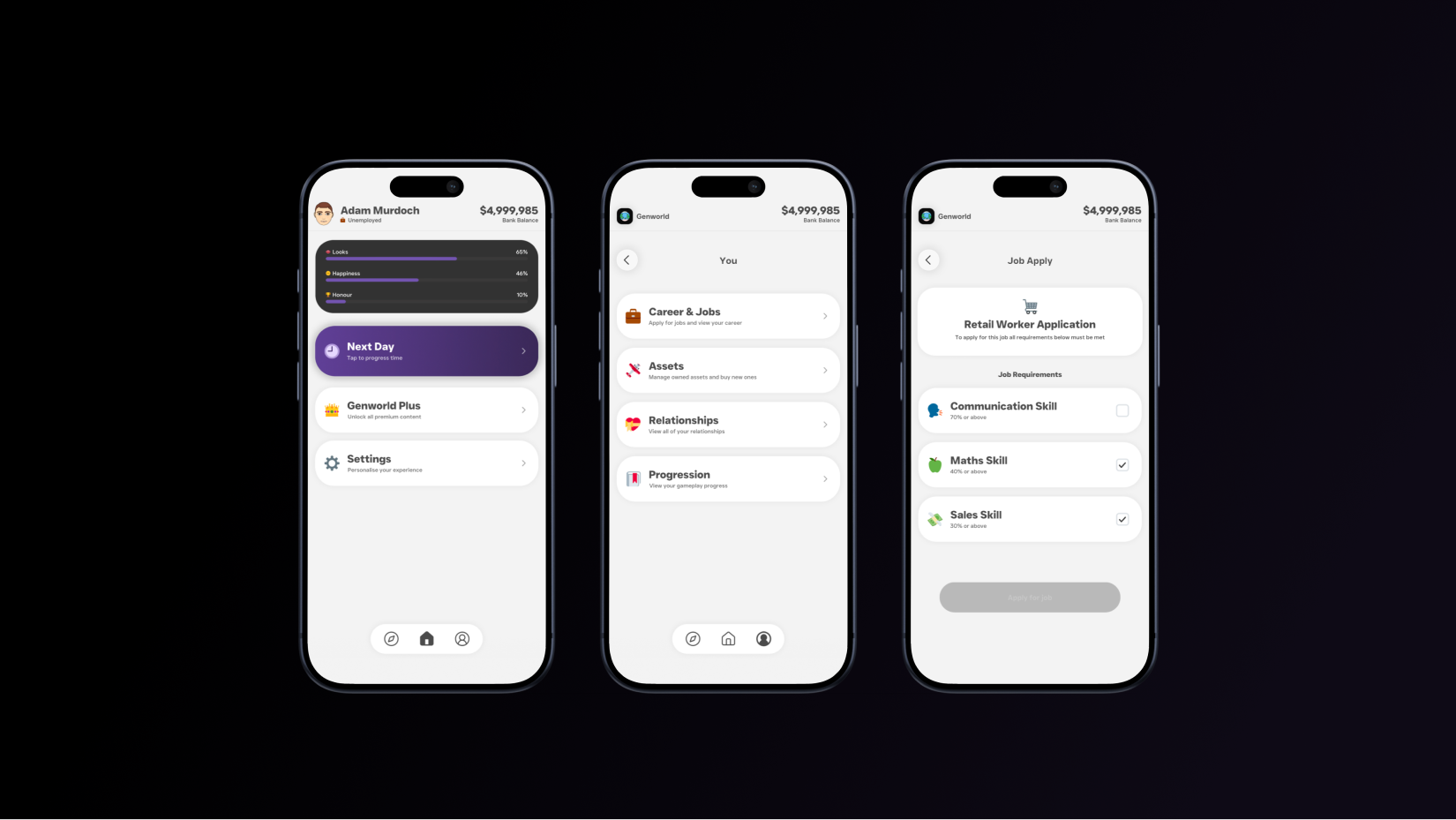
After deciding on a concept, I used Maze to test the user flows within a high-fidelity mockup. From the 72 participants, the success rate for task completion within the prototype was good, but users commonly misclicked two key buttons while completing the task. This highlighted that while most users successfully completed the task of getting their first in-game job, many users had moments of confusion regarding what to press.
82.8%
17.2%
The hamburger menu and "progress" button confused users on what to press
Many users raised the need for more contextual information alongside buttons
World icon looked like a navigation icon
Added explicit text labels alongside icons on the bottom navigation
Renamed "Progression" button to "Skills & Progress" along with a subtitle describing the button's function
Changed world icon from a compass to a planet
40,000+
40 Minutes